IMP Awards > Annual Awards > 2004 > Worst Blockbuster Poster Winner

Poster design by Crew Creative Advertising
Alternate designs (click on thumbnails for larger version)
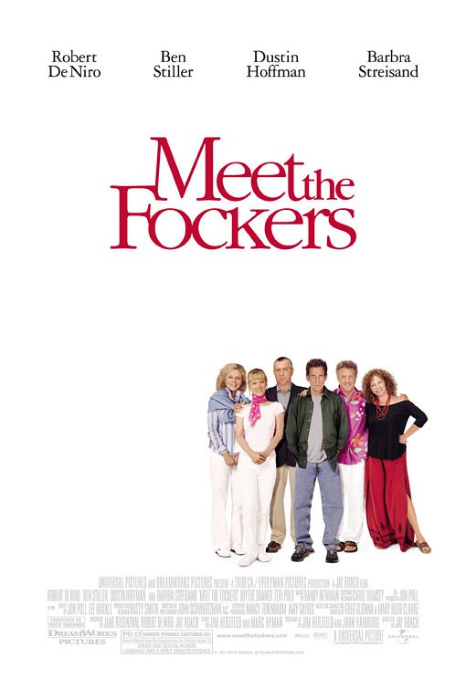
Meet the Fockers (2004)
Lots of white space and a small group picture of the cast. Meaningless, and certainly not funny. The only way it could be worse is if everyone's pictures had just been pasted together.


